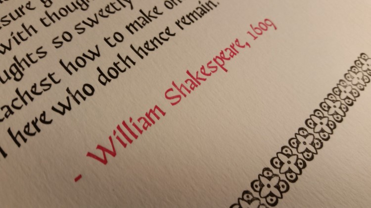
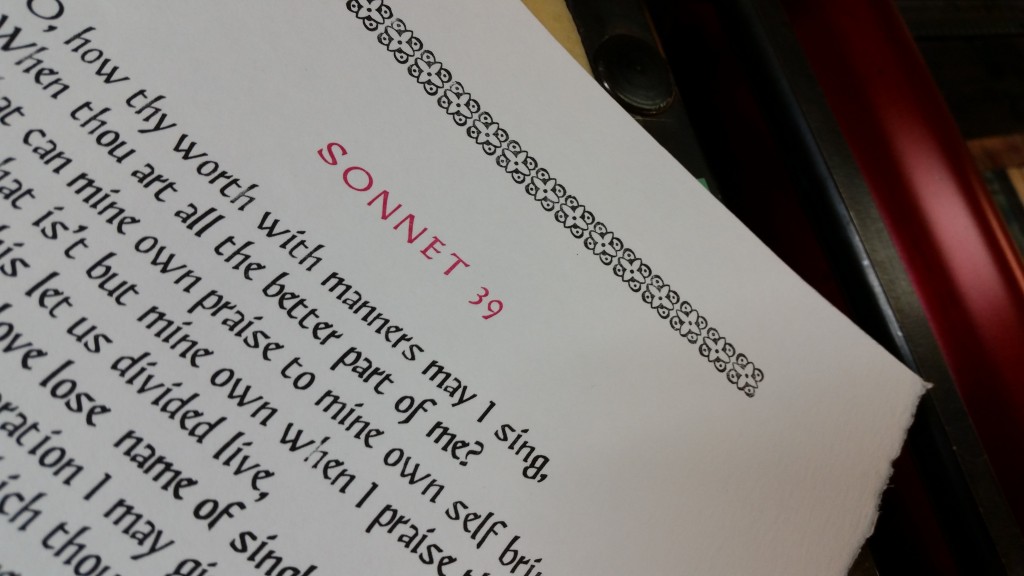
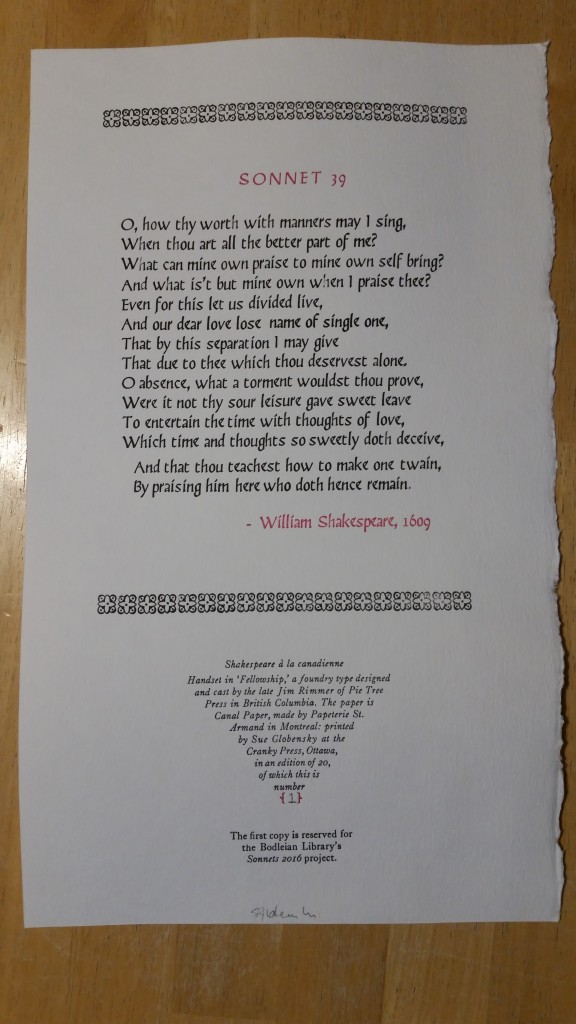
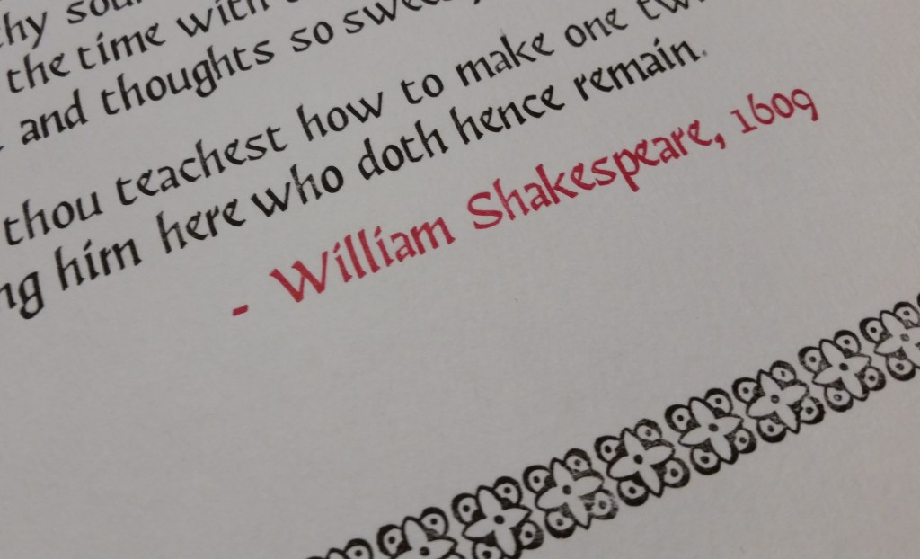
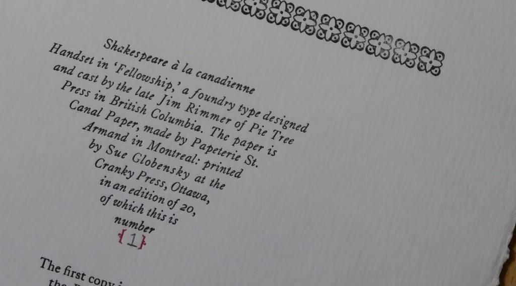
In January of this year, the Bodleian Library announced a wonderful initiative to commemorate the 400th anniversary of the death of Shakespeare. Sonnets 2016 invited letterpress printers from around the world to participate by printing one of the Bard’s 154 sonnets, a copy of which was to be deposited with the Bodleian in order to create a complete and contemporary edition of the entire sonnet cycle.
I was both lucky and thrilled to be selected as a contributor – and happily set to work on a broadside edition of my assigned sonnet. It’s number 39, part of the “Fair Youth” series forming the early poems of the sonnet cycle – addressed to a mysterious young man whom Shakespeare held in close esteem.
I decided to add a touch of Canadiana to my sonnet by using some lovely Canadian-made paper and type. My intent was two-fold: firstly, I want to allude to Shakespeare’s lasting influence that spans time, nations and languages. That Canadians today are among people around the world who still study and read the Bard is reflective of his timeless appeal.
Secondly, I wanted to use the relatively small influence that my role in this project may have as a means to highlight a beautiful typeface designed by the late Jim Rimmer. Well-respected as both a typographer and printer, Jim designed and cast “Fellowship” at his Pie Tree Press in British Columbia. Hinting at both an uncial and black letter heritage, “Fellowship” seemed the perfect type for this project. It lends a certain elegance and serenity to these beloved lines — at least in my mind, anyway.
The colophon was to be the vehicle by which I conveyed my Canadiana message – though it did present something of a challenge to my design and type-setting skills. Wanting something diminutive, I opted for one of my favourite typefaces (and my house font) in 12-point; Caslon, Old Style italic. Since it appears on the front of the broadside, the colophon had to be muted, subtle – yet still harmonious to the overall project. It needed to convey all the production details succinctly, without superfluous verbiage. Perhaps over-confidently, I decided to challenge my word-spacing skills with a diminishing triangular form – and set to work with armed with all the rules of word-spacing that I could recall.
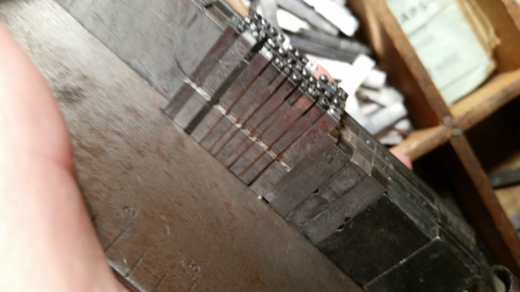
Things were going swimmingly until the, um, second line, where I was stymied by the words and spaces that lay loose in the stick. Knowing full well that Frederick Goudy would consider this akin to sheep thievery, I nonetheless attempted to letter-space the word “Bodleian” with copper spaces. As I finished justifying the line, I felt guilt growing stronger in my heart. Gamely, I tried to ignore it. No luck. I felt like the Ghost of Goudy had arrived to bellow at me:
A man who would letter-space lower case would steal sheep.
Now, it’s my understanding that Goudy had actually said this of black letter, not lower case type. And he didn’t actually say “steal,” but “bugger.” Still, I got the message – loud and clear. I dissed it all (after I took a quick photo to document my folly!) and then started over.
Still, a good learning experience – and a short-edition project that’s taking shape nicely. #154sonnets.
