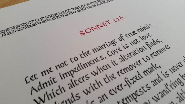
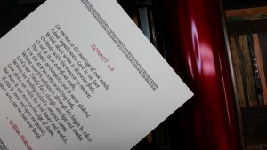
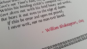
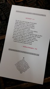
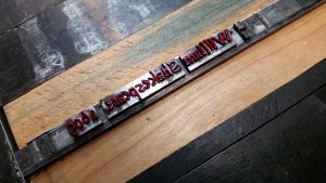
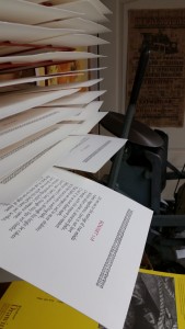
Full circle, it seems. Inspired by my participation in the Bodleian Libraries’ Sonnets 2016 project, I’ve decided to reprint Shakespeare’s Sonnet 116.
Some context: I stumbled into letterpress and the book arts while working with the National Library of Canada’s (now Library and Archives Canada) exquisite collection of private-press books and livres d’artistes. So taken was I with the creativity, form and execution of these beautiful pieces, that I decided learn more about the craft itself. A brief weekend course in basic letterpress techniques was my first introduction to the craft, courtesy of woodcut artist and master printer, Margaret Lock (Locks’ Press, Kingston).
It was at her studio that I painstakingly composed my very first letterpress project: Shakespeare’s Sonnet 116. I chose it because it was one of five Shakespearean texts I had memorized for a high school English class. It is a poem that has followed me over the years; through undergraduate and graduate degrees in English, amateur theatre – and into an enduring marriage that has lasted over 30 years. It is a text that continues to instill peace within me while it continues to provoke lively debate amongst scholars.
And so it was the very first text I set and printed at Margeret Lock’s workshop so many years ago. I remember standing in her studio, the sunlight dappling over the type cases as I puzzled over the assortment of lead bits before me. The composing stick awkward in my left hand as I struggled with the alien geography of the type case. I think it took me an entire day to compose the text. Slowly, carefully, I would scan the case, tentatively picking up a sort, checking it carefully before I lay it in the stick. Fourteen lines in seven long, lovely hours.
Printing the sonnet took place the following day: Margaret’s perfectly-calibrated Vandercook SP 15 – along with a variety of softly dampened art papers – made printing a dream. And I remember how I marveled when that first print rolled off the cylinder; how excitement bubbled up in me as the printed copies curled off the press with clean, crisp Bembo text kissed lightly onto each paper.
There are many flaws in that first project; a few typos that I didn’t catch, uneven spacing and a few slurs on some prints, but I was suddenly and thoroughly enamored with the craft. And to this day, when I look at the print I gave to my husband, I still experience the joy I felt while setting and printing it.
It’s been nearly fifteen years since I first set that sonnet. In the interim, I’ve acquired a press and print shop, learned a bit, made lots of mistakes and learned some more. I still marvel at the process, delighting each time a print comes off the press.
Last week, I reset Sonnet 116 using Jim Rimmer’s beautiful Fellowship typeface. It didn’t take seven hours to set this time – and I’m not so naive anymore about the work required for a finely calibrated press. It’s a short edition, but one I am quite pleased with — the Rubine Red ink lending a perfect subtle, accent to the elegance of the black text. Once again I’ve found joy and delight.
