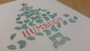
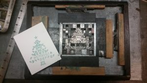
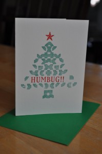
Press work continues on a small scale, with seasonal greetings, courtesy of Ebeneezer Scrooge. I am still learning the basics of two-colour registration – and while I am generally pleased with the cover of the card, I was dismayed to see that the green ink had begun to clot. I suspect that this is due to improper sealing of the ink tin.
For the interior message, I tried Franklin Bold, a sans serif typeface that I thought would compliment the cover text and provide a nice contrast to the blackletter I wanted to use for the word “Christmas.” I had never used this typeface before – and this fit nicely with my plan to proof every set of type that came with my print shop acquisition.
Humbug.


